"did vincent van gogh have a color vision deficiency?" is the driving thesis behind
this awesome post from it's okay to be smart, one of my favorite science-y blogs. according to
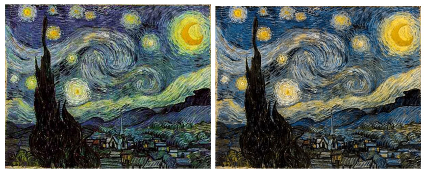
kazanori asada, van gogh's paintings under chromatically filtered light (to imitate the experience of those with a vision deficiency) looked warmer and more natural as compared to them when viewed normally. other works could suggest the possibility of a form of colorblindness, as well:
 |
| original |
 |
filtered
|
 |
| original |
 |
| filtered |
I'm pretty sure I prefer the originals, despite their distance from reality when it comes to the particular tones van gogh used. the interesting color choices might be part of what attracts me to his works, anyway.
No comments:
Post a Comment